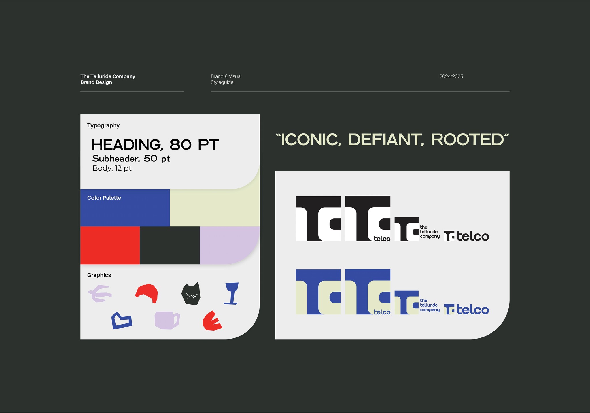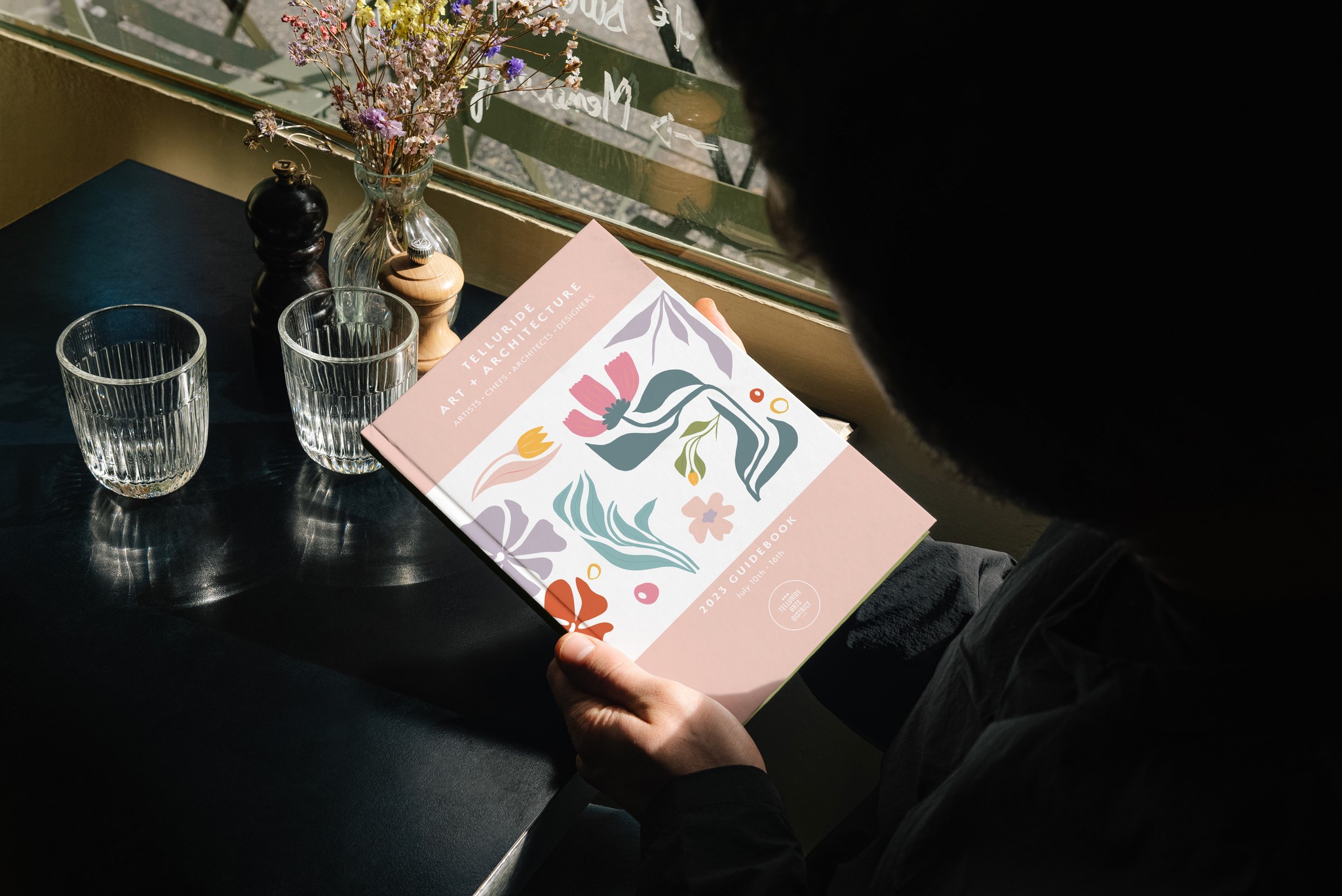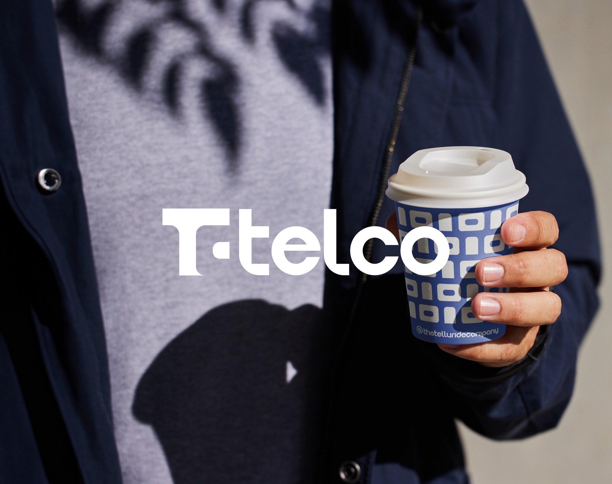


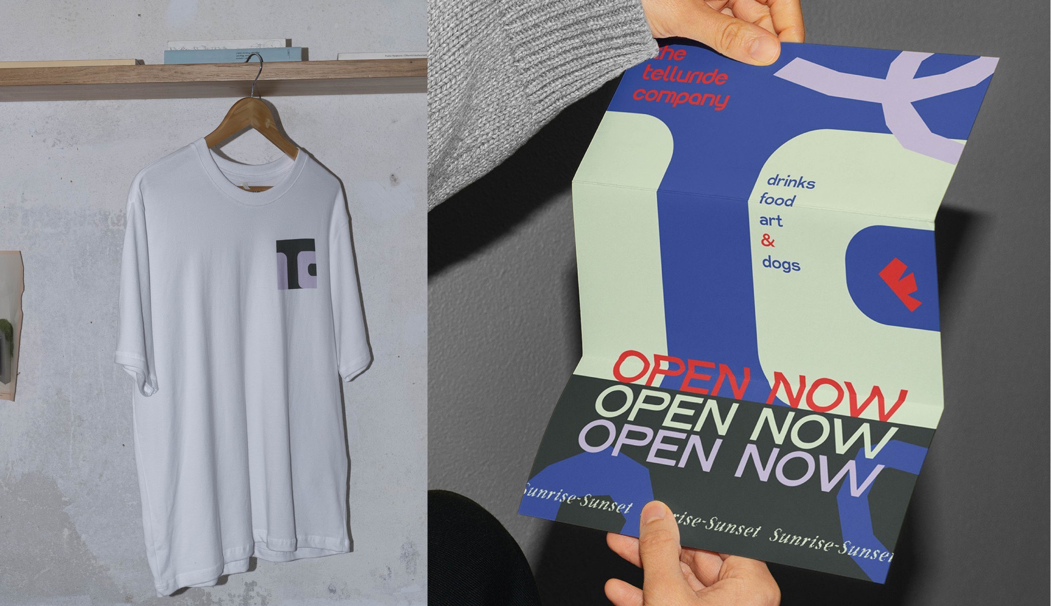
Start over. Convincing the team that simply going retro wasn't going to do it, to be okay with not appealing to the lowest common denominator, and to be current but not trendy are foundations of the brand. Telluride is well known and getting fancier by the day. The town is full of t-shirt shops and old western themed hat stores. We knew we couldn't be that, but it's also not a place where you can be a hipster coffee shop with a snarl.
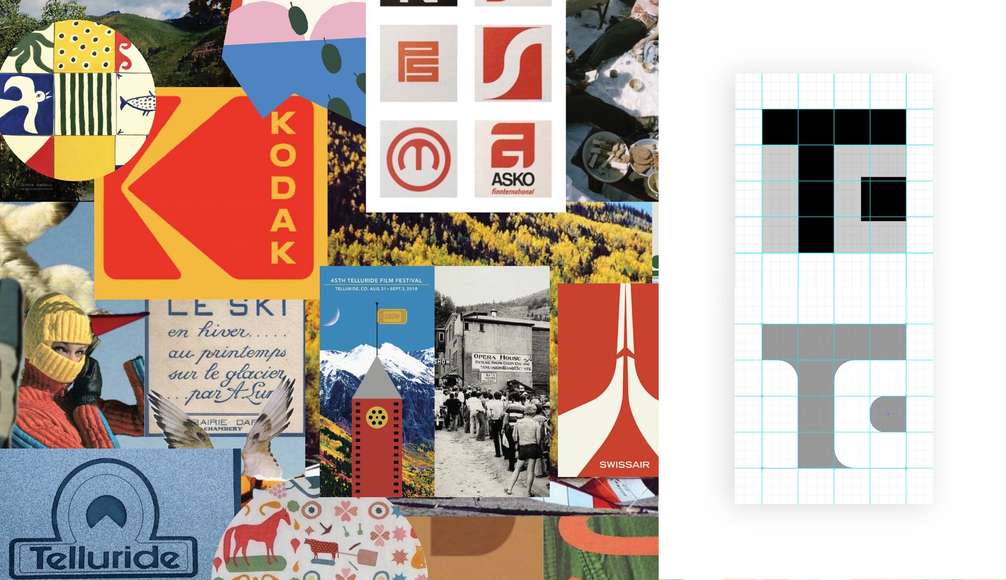
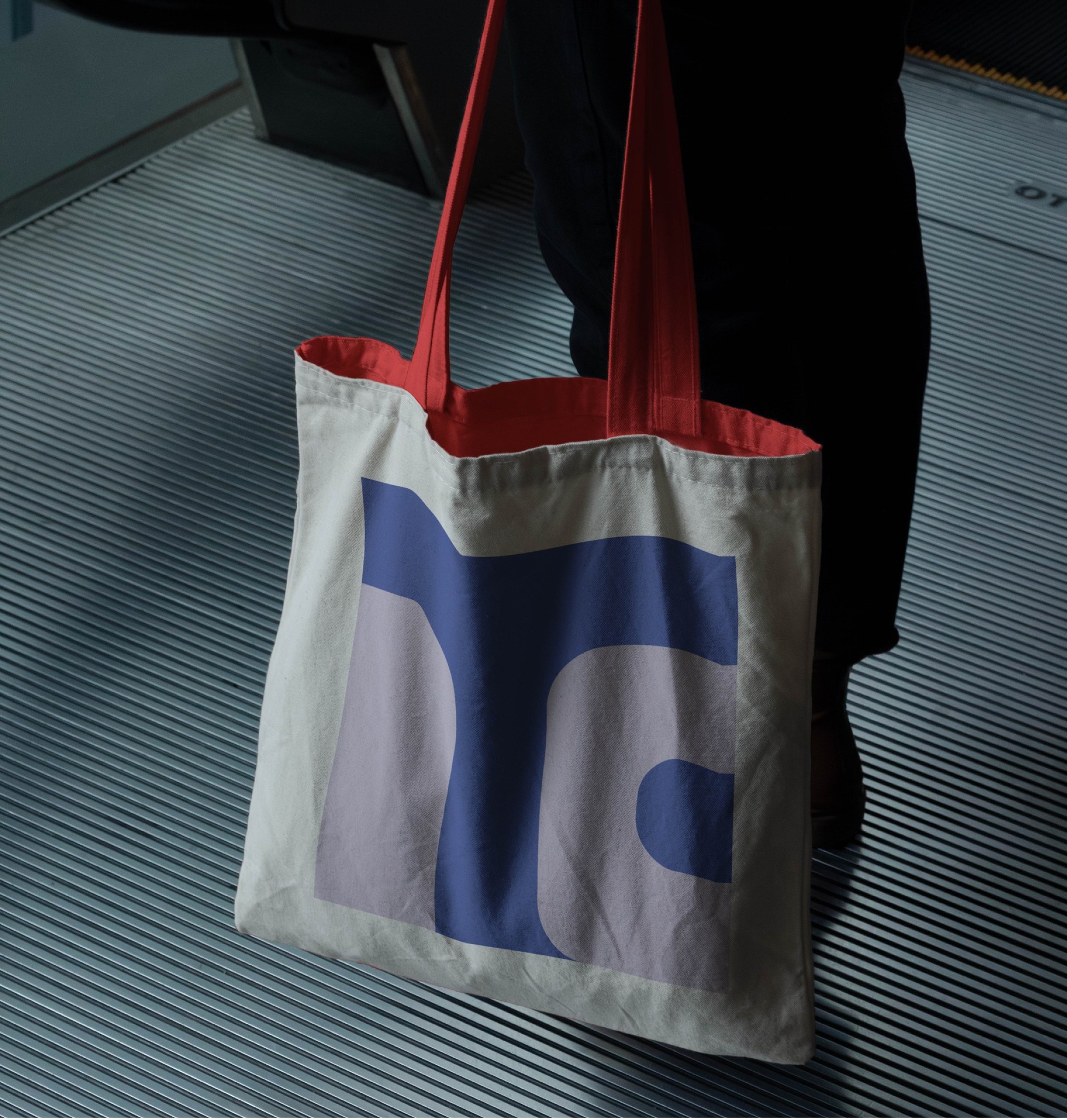
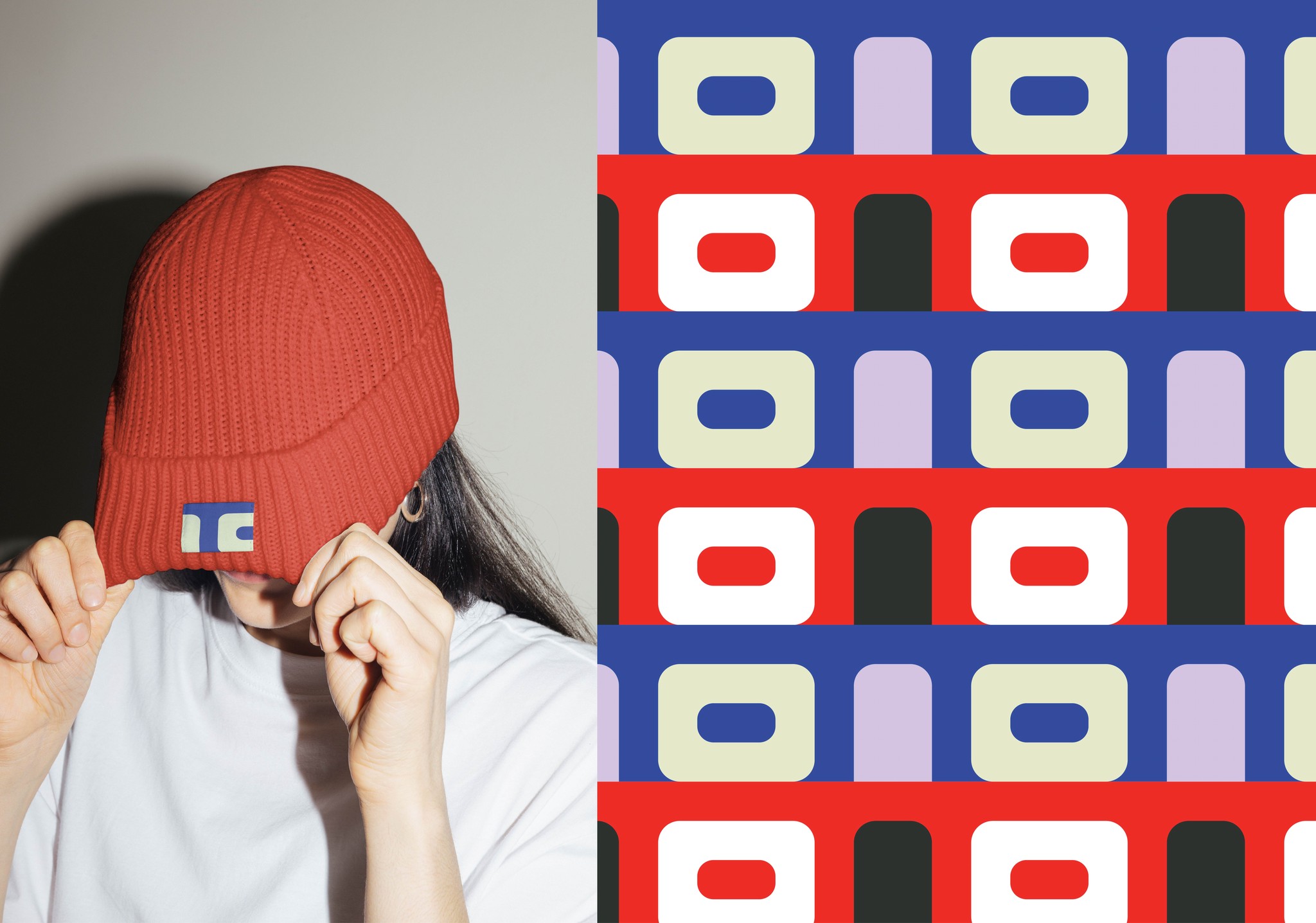
I made sure to use colors not obviously associated with Colorado or mountain towns, typography that while rooted in 1990s early computer-world was timeless and timely. The mark itself was an exploration inspired by Saul Bass' big corporate logo work; flat, two color shapes, but when applied to the daily business of a cafe was something you'd wear on a hat or a shirt.