
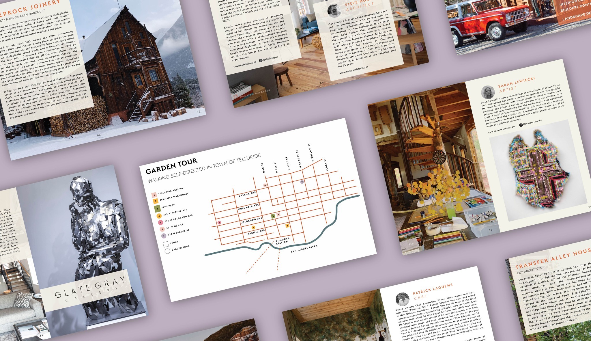
In previous years, Telluride Art + Architecture Week struggled to capture the attention it deserved. Tucked under the umbrella of its parent organization, Telluride Arts, the event lacked a distinct identity, getting lost in the noise rather than standing out as a must-attend celebration of art, design, and local culture. The challenge was to separate the brand and give it room to breathe, creating a visual language that reflected its unique character while maintaining a subtle connection to its roots.
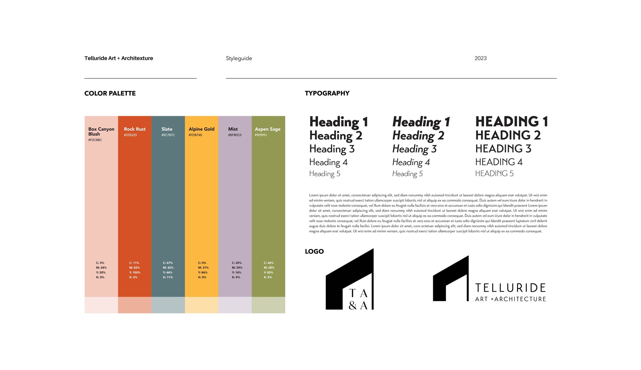
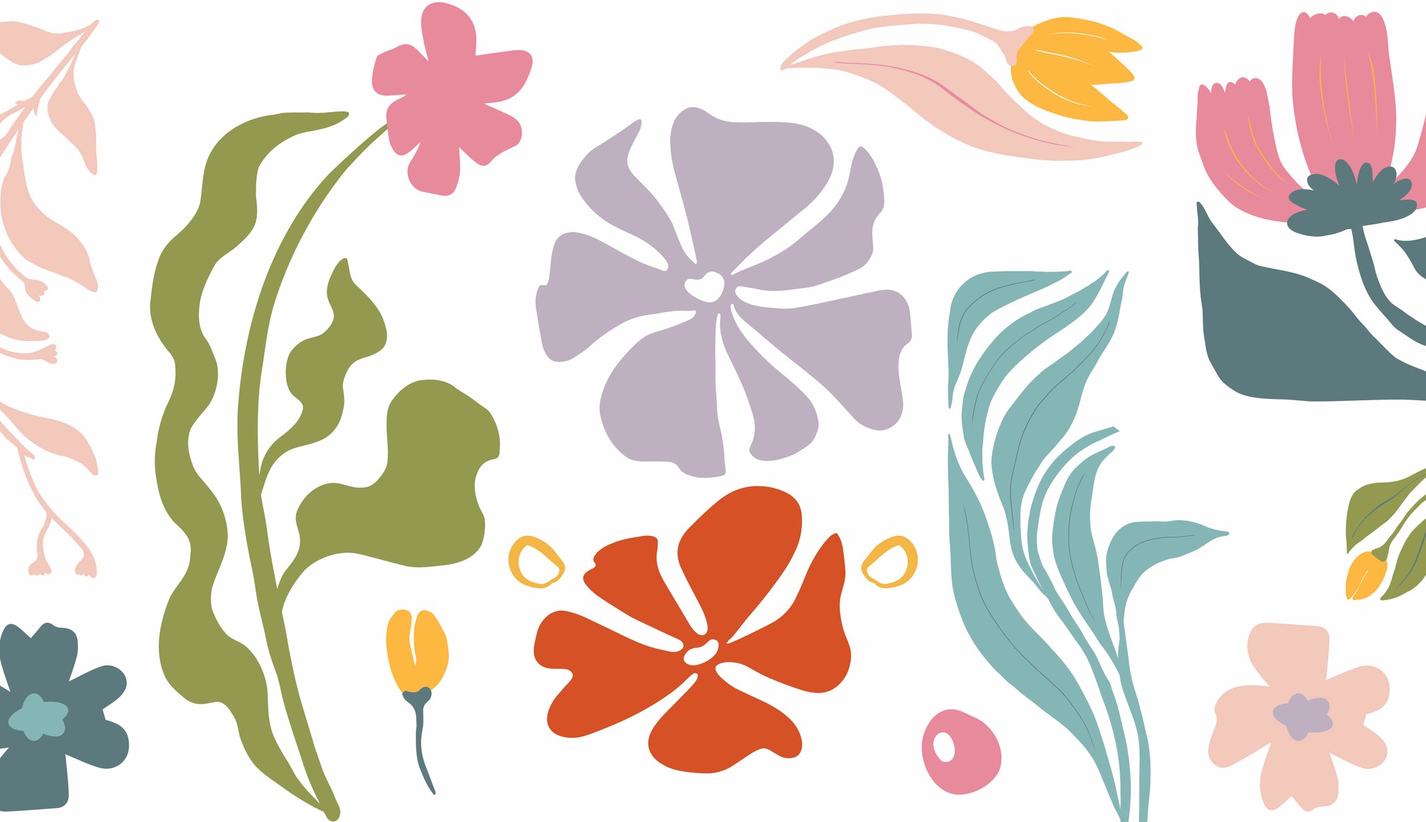
I leaned into Telluride’s natural charm and cultural richness, designing print and digital assets that echoed the event’s new energy. The refreshed identity gave Art + Architecture Week a voice of its own, bold, engaging, and reflective of its eclectic offerings.
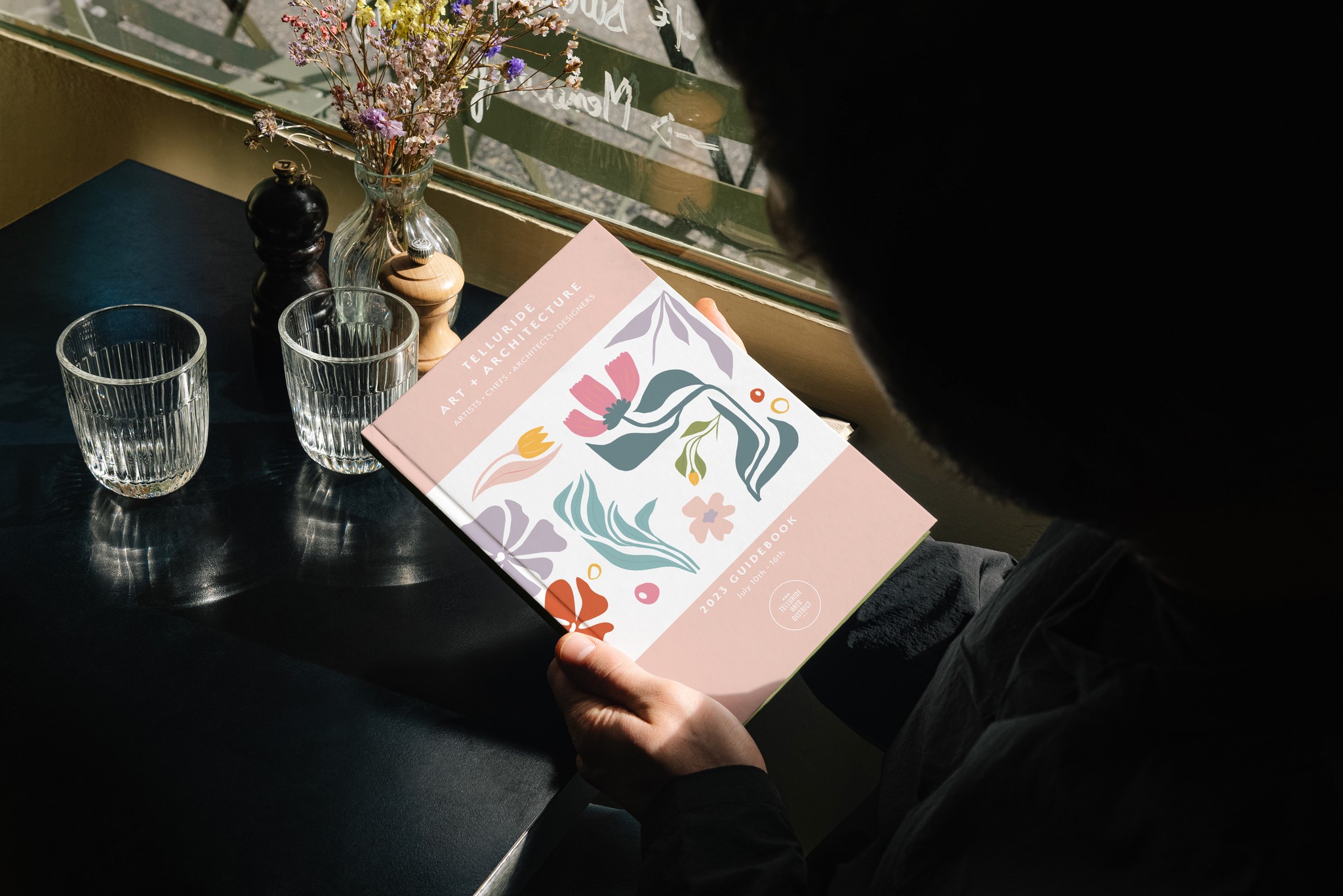
The event booklet wasn’t just a guide, it was a keepsake that captured the essence of the week.
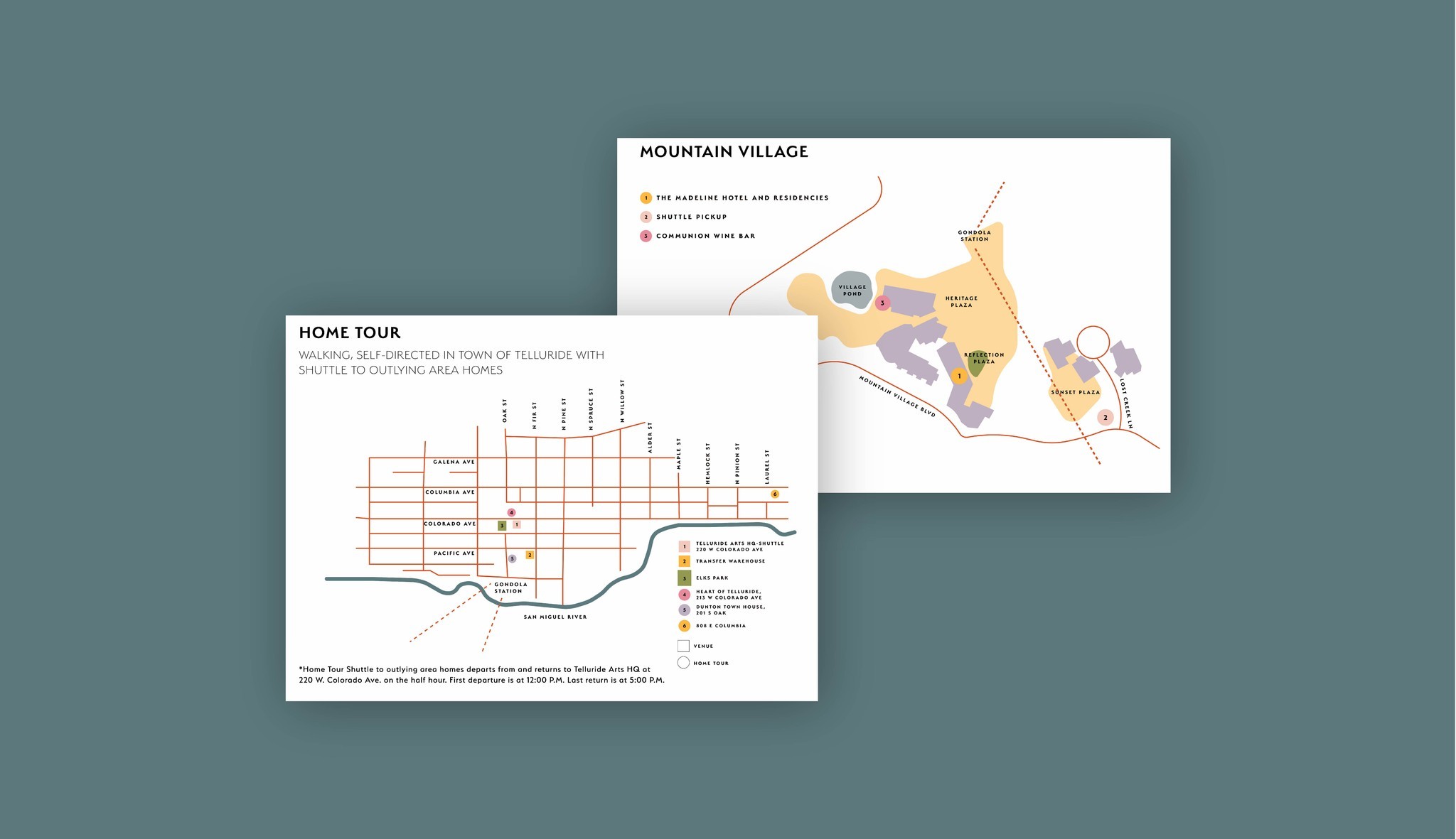
A festival where the design enhanced, rather than distracted from, the vibrant experiences. Attendance grew by over 20%, and the event gained momentum as its own brand, no longer living in the shadow of its parent Telluride Arts. Attendees praised the clarity and elegance of the materials.