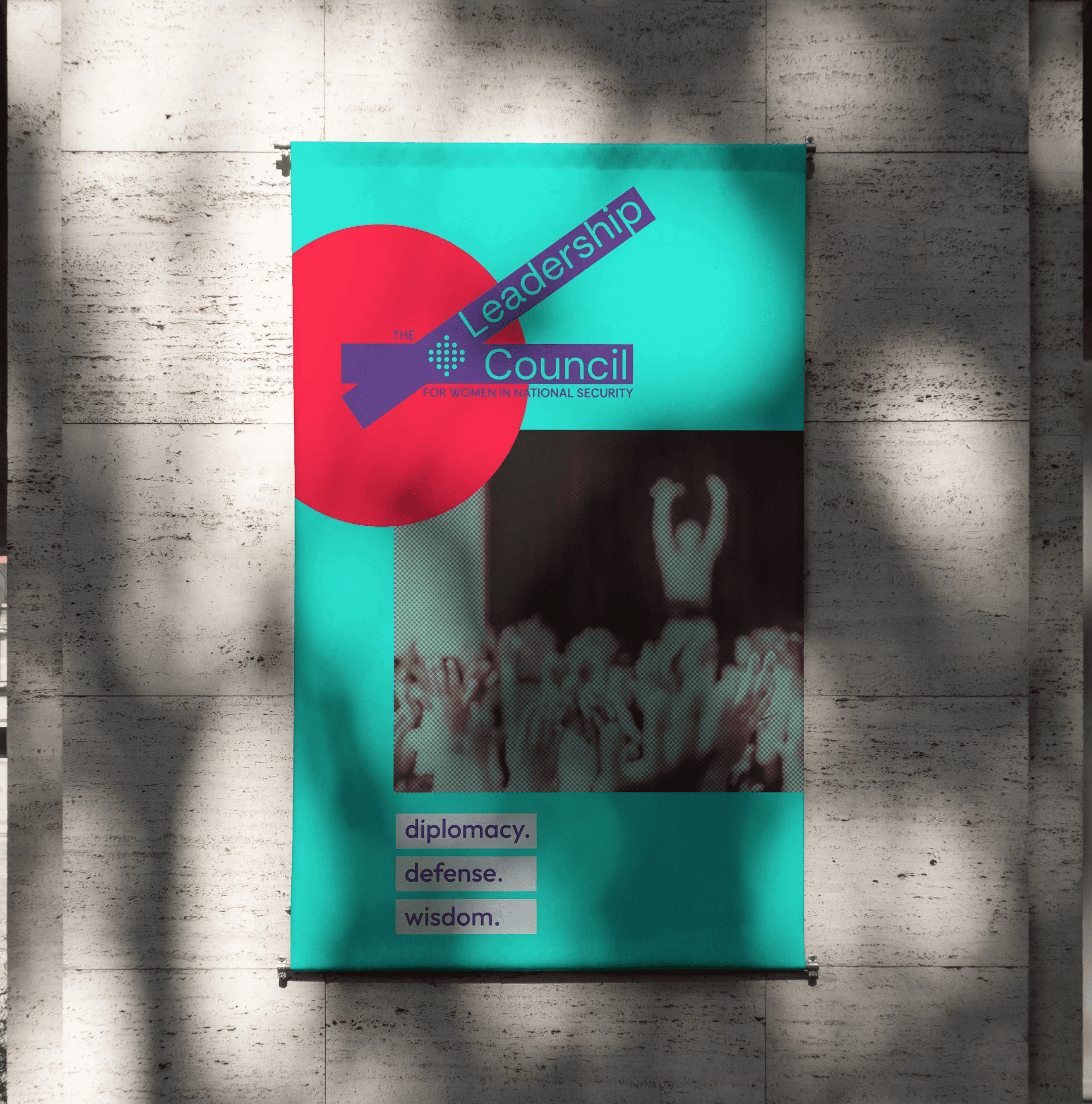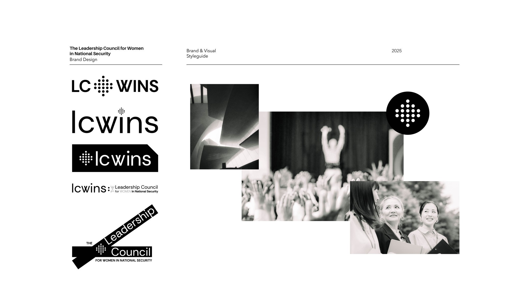
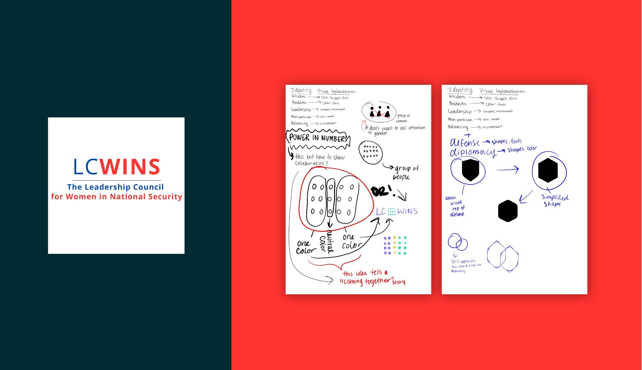
Political brands are tough. For LC WINS it was a balancing act. LC WINS is short for "The Leadership Council for Women in National Security", an incredible organization that tackles really sticky issues. The organization itself is non-partisan so the typical blue and red in their previous logo wasn't working. It's a coalition of women, so a nod to the feminine was important but wasn't meant to be the star, oh, and it's also an organization that works on defense and diplomacy and is made up of some seriously tough and brilliant people.
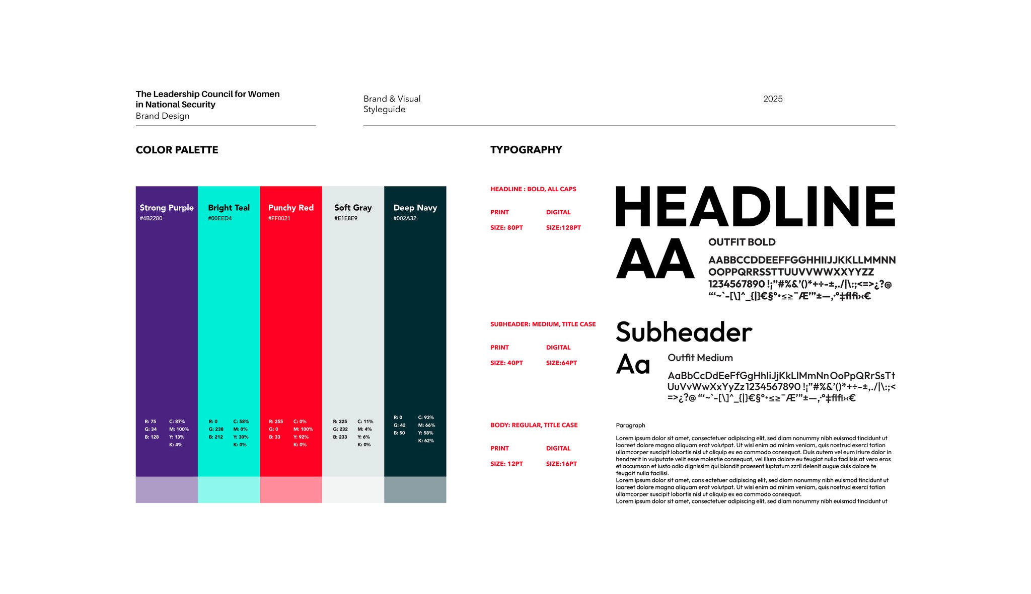
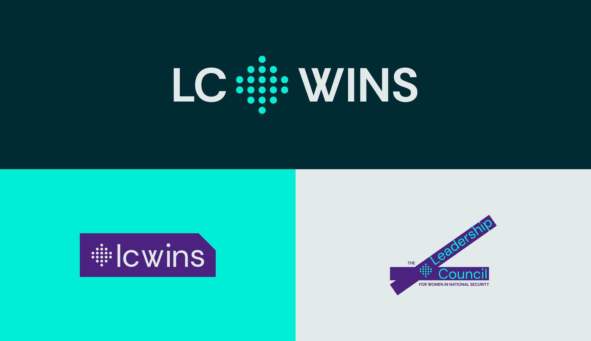
The new LC WINS is eye-catching and timely. The color palette uses the purple throughout to anchor the design and is offset by the bright teal which serves as part of the wordmark or can be expanded to serve as a canvas. The shield emphasizes that this is a coalition. The brand doesn't scream or shout but calmly and energetically demands to be taken seriously.